Solstice Sunset Colorblock Throw Blanket in Terracotta, Rose & Cream — Warm Modern Design for Your Everyday Retreat
Solstice Sunset Colorblock Throw Blanket in Terracotta, Rose & Cream — Warm Modern Design for Your Everyday Retreat
Couldn't load pickup availability

Solstice Sunset Colorblock Throw Blanket in Terracotta, Rose & Cream — Warm Modern Design for Your Everyday Retreat
☀️ Your room, in its golden hour.
A terracotta wall catching the last light. A rose-colored sky. The quiet glow of a room you are happy to come home to. Solstice gathers those colors into a single expressive blanket, balancing rust, burnt orange, dusty rose and cream in broad, gently curving fields.
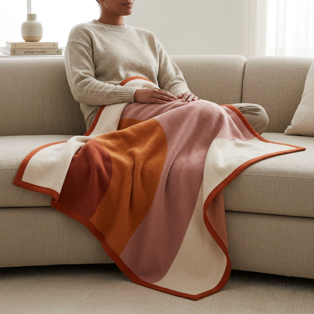
Rather than relying on tiny decoration, this design lets proportion do the work. A wide cream area gives the warmer shades room to breathe. Dusty rose softens the transition between orange and ivory. The rust-colored border draws the whole composition together, like the final line around a carefully chosen artwork.

The palette, unpacked
Terracotta brings an earthy foundation that sits naturally beside wood and clay. Burnt orange supplies the bright note, but without a sharp primary-color effect. Dusty rose adds a more unexpected dimension, making the palette feel layered rather than simply autumnal. Cream creates contrast and connects the design to the pale upholstery and bedding shown in the gallery.
The close-up images focus on the fine, softly brushed-looking surface and the narrow bound edge. Unlike a fringed throw, Solstice ends with a continuous outline. That restraint matters: it keeps attention on the curves and colors, especially when the blanket is folded into a few broad sections.
A closer look at the color transitions
Solstice is built around broad passages rather than a fine repeated print. Rust and orange establish the warm side of the composition, dusty rose gives it a gentler transition, and cream opens a lighter area beside them. When the blanket folds, a different combination comes forward: one arrangement may show more rose, another more cream. You can change the emphasis simply by turning the fold, without introducing another decorative object.
Notice the relationship between the border and the interior. The rust edge is narrow compared with the large color fields, so it outlines rather than dominates them. At the folded corner, it creates a clear turn that makes the finishing detail easy to see. The result is less casual-looking than an unfinished outline and quieter than a fringe, keeping the broad color composition at the center of the design.

Surface detail, without visual noise
The macro photograph shows a fine, gently fuzzy-looking surface instead of pronounced loops or deep ribbing. That restrained texture matters because the colors already make a strong statement. A heavily sculpted surface would introduce another competing pattern; here, the close-up interest comes from the textile grain and the boundary between one shade and the next.
Look at the cream area beside the rose and you can see how the softer visual finish changes the transition. It does not have the hard, glossy appearance of a painted object. The fields remain distinct, but the blanket still reads as a textile when seen at close range. The edge photograph then brings the eye back to the continuous rust frame.
Build your room around one of three moods
- The sunlit apartment
- Use cream upholstery, pale oak and simple glass or ceramic accessories. Let an orange section remain visible on the sofa, with a larger cream section beside it. The palette becomes a warm accent rather than a full-room theme.
- The earthy retreat
- Pair terracotta with medium-toned wood, a clay-colored vase and warm off-white walls. Keep the accessories matte so the composition stays grounded. A rose section adds a quieter note among the earth tones.
- The contemporary bedroom
- Begin with plain ivory bedding and a simple headboard. Fold Solstice across the lower part of the bed, then loosen one corner to show a change of color. Avoid adding a second large colorblock pattern nearby.
The fold is part of the composition
For a tidier arrangement, make a broad lengthwise fold and place the rust edge parallel to the furniture. For a softer arrangement, begin with the same fold, then lift the middle slightly and let it settle into one or two relaxed curves. The first version emphasizes the outline; the second shows how the color fields travel across the surface. A few visible folds are more expressive than a perfectly flattened rectangle.
On a sofa with several seat cushions, keep the blanket mostly to one side rather than stretching it across every seat. That leaves a quiet area around the warm colors. On a chair, bring one cream section forward so the border is easy to distinguish from the darker parts of the design.
A note for color lovers
If you already own rust or pink accessories, you do not need an exact match. Different depths within the same color family can make a room feel more collected. The useful link is the warm undertone, with cream serving as the common background. Start with the blanket, then remove any accessory that makes the scene feel crowded.

Three ways to give the room a warmer point of view
- Start with the sofa. Let the blanket fall over one arm and onto the seat. Keep a cream section beside the upholstery so the warmer colors read as an accent rather than an interruption.
- Finish the bed. Place it across the lower portion of neutral bedding. A little extra drape at one corner brings out the curved color composition.
- Make a personal corner. Add an unglazed ceramic bowl, a low wooden table and a simple lamp. The blanket supplies the color, so everything else can stay quiet.
For the hours with no agenda
The person-use image shows Solstice laid across a lap on a pale sofa. It is a useful way to understand the design beyond a styled fold: the warm blocks remain distinct even as the fabric bends and gathers. The composition feels relaxed rather than formal, which is exactly the mood this piece is intended to bring to a room.
A considered edit, not another layer of clutter
Choose one accent from the blanket and echo it once elsewhere, perhaps in a cushion or a ceramic vase. Resist matching every shade. Solstice is most expressive when it has room to be the focal point.
The offering is one colorblock throw blanket; furniture, bedding and decorative accessories shown in the images are styling props. No gift box is represented as part of this design.
Give your everyday retreat a little golden-hour color.